Product Details Redesign — policy clarity for advisors and their clients.
The UX team ran extensive research on the product details UI for wealth and insurance policies inside the Canada Life digital product Workspace. A new AEM-driven approach gave us the flexibility to add and remove labels on the fly and align with the Canada Life brand. Ten advisors reviewed the prototypes in Advisor View and Customer View.
- 10
- Advisors interviewed
- 3
- Product prototypes
- 2
- Rounds of synthesis
- 45–60
- Minutes per session
The legibility problem
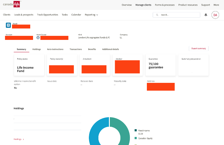
The digital product of Workspace lets Canada Life financial advisors view and manage individual customer details, submit documents and view policy details, with access to forms, process guides, marketing resources and more.
But policy details were locked into a rigid legacy layout: hard to change, off-brand, and dense with figures that advisors had to translate for their clients on every call.
Rebuilding the page on AEM meant labels and data could flex per product line, and the page could finally look like Canada Life.
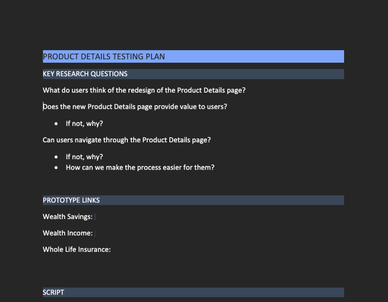
This case study covers the research itself — the plan, the prototypes, the interviews, the synthesis, and the findings that shaped the final design.
Does the redesign land?
What do advisors think of the redesigned Product Details page — and does it read as an improvement over what they use today?
Does it create value?
Does the new Product Details page provide real value to advisors and their clients — and if not, why not?
Can they navigate it?
Can advisors move through the page and find what they need, and how can we make that process easier for them?
The interview script branched depending on whether the advisor was wealth focused or insurance focused, but these three questions anchored every session and framed the testing plan.
The updated AEM approach lets us align closely with the Canada Life brand, and gives us better flexibility when we need to change the data being pulled in, or the labels around it.
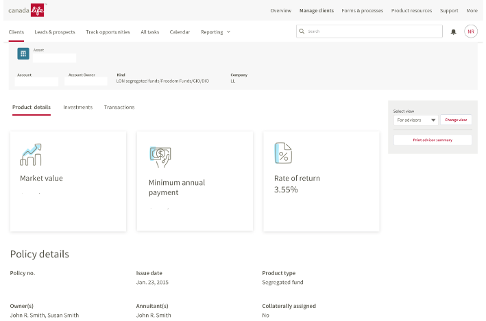
Simulated data
During the first round of interviews we asked advisors whether they were wealth or insurance focused, then shared the prototype specific to that preference — each viewable in both Advisor View and Customer View.
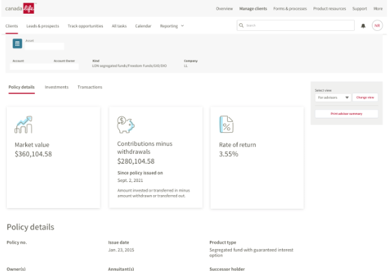
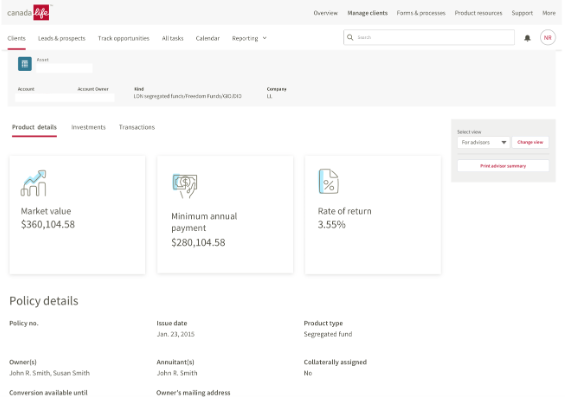
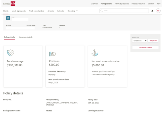
Simulated data
Recruit across both product lines
After the first batch of interviews there was a heavy focus on wealth. This gave us insightful feedback, but we took steps to send out more recruitment emails to specifically request insurance focused financial advisors. The end result was five wealth advisors (3 MGA, 2 Canada Life direct) and five insurance advisors (4 Canada Life direct, 1 insurance advisor assistant).
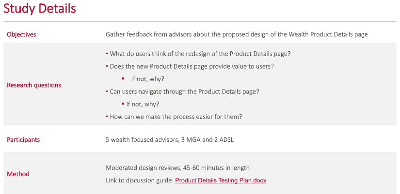
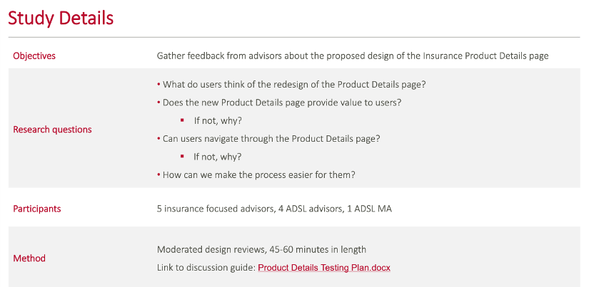
Moderated design reviews
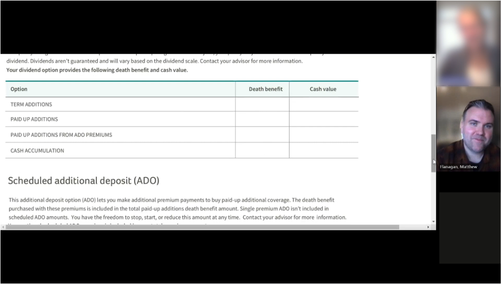
Each 45–60 minute session walked an advisor through the prototype matched to their focus, switching between Advisor View and Customer View to see how they would use the page in front of a client.
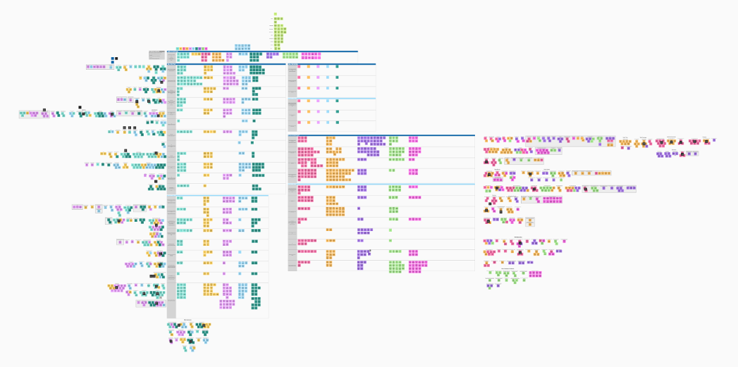
Synthesis and affinity mapping
Once the wealth interviews were complete, we synthesized the research and presented findings on wealth. We then finished the insurance interviews and presented a second set of findings specific to insurance.
“That number would alarm my clients.”
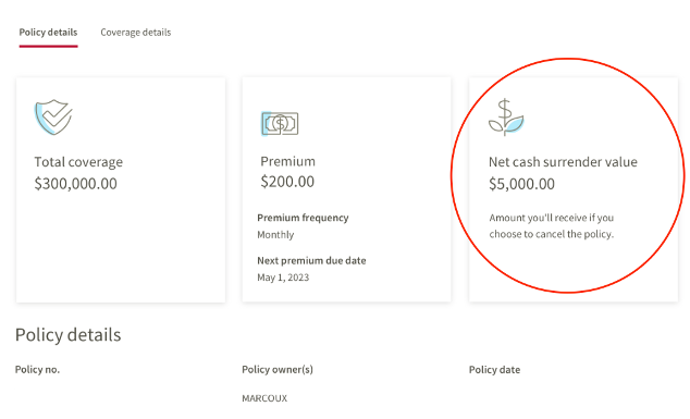
One specific example of feedback was about a label on our insurance UI, centred around the Whole Life PAR policies, "Net Cash Surrender Value". The advisor expressed concern that the value can look like a very low sum of money for the first 5–10 years of owning the policy. This advisor raised concern that the figure would be alarming for her customers, and suggested removing it completely, or revisiting its prominent location within the design.
Simulated data
Customer view is the standout
Advisors love the customer view — it helps when there is confusion on the customer side and gives them a shared reference during a call.
More context on title cards
Advisors want to see how the totals on each title card are broken down, rather than a single unexplained figure.
Totals in the tables
Add totals to dividend tables and other data tables, so advisors don't have to add figures up themselves.
Visualize the data
Add graphs and charts, to help visualize the data and make the policy details easier to understand at a glance.
Client date of birth and age
Surface the client's date of birth and age to a more prominent location, as this is always information advisors are seeking regularely.
Beneficiaries, higher up
Move the beneficiaries section to a prominent location — initially on a second tab, it has been moved into the policy details tabs throughout.
Banking information
Add banking information! This data is very valuable for advisors to have on the page for access when needed. (this enhancement is actively being worked on).
Labels and prioritization
A range of smaller items relating to label wording and how content is prioritized on the page was shared and documented. We will monitor these findings and make changes as needed.
Outcome
Overall — a very positive reception of the changes, and advisors are excited about the approaching launch of the new design.